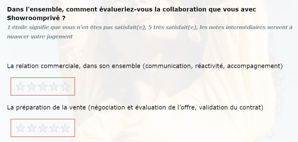
Find below a screenshot of one of my survey star rating question, as you can see I feel like we don’t see the stars enough, is there anything I can do to highlight them or maybe add square around them.
Note that I already have below Javascript for the question :
Qualtrics.SurveyEngine.addOnload(function() { jQuery("#"+this.questionId+" tr").each(function() { var row = jQuery(this); var th = row.after("<tr></tr>").find("th").attr("colspan","4").css("text-align","left"); th.remove(); }); $('thead').remove(); });
Let me know if you have any idea :)
Page 1 / 1
Hi, the stars themselves are tough to customize because they are static images. To modify how the stars in the slider look, you have to replace the below CSS rule with your own background image, discussed a bit here:
Another option is, like you mention, to change the background of the space behind the stars. Adding the below CSS to the Style section of the Look & Feel will do this:
Another option is to use the Multiple Choice question that has been modified to select an answer choice when a star character is clicked. The stars in this method are easier to customize in terms of size and color. That option is discussed in this post.
Hello @Tom_1842
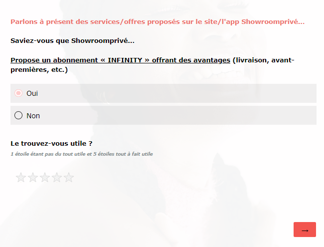
Thank you so much for your answer I tried the second option it seems to work pretty good !
Is there a way I can out square the stars without filling it just a black rectangle aroud the stars maybe ?