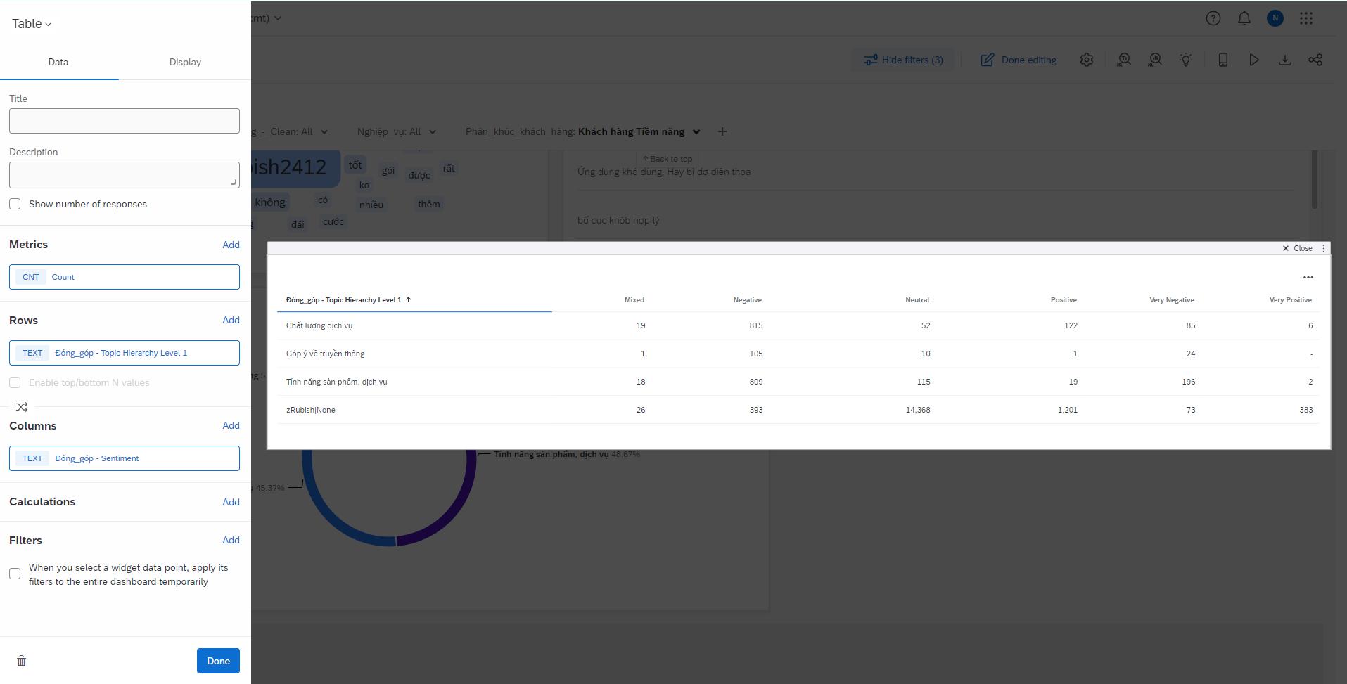
I have a list of topics analyzing my open-ended responses and I would like to create a visualization showing an aggregation of the sentiment labels in a more precise way than what is currently available. Current visualizations show each topic sentiment label as a separate line in a table. Example:

What I would prefer (and what would be more readable) would be a table that shows a topic as the row and then a column for each sentiment label. Example:

Is there a way to do this with the current system? Or a way to do something similar? I’ve played around with both the old and new Results tab visualization options and I can’t seem to find a good solution.


