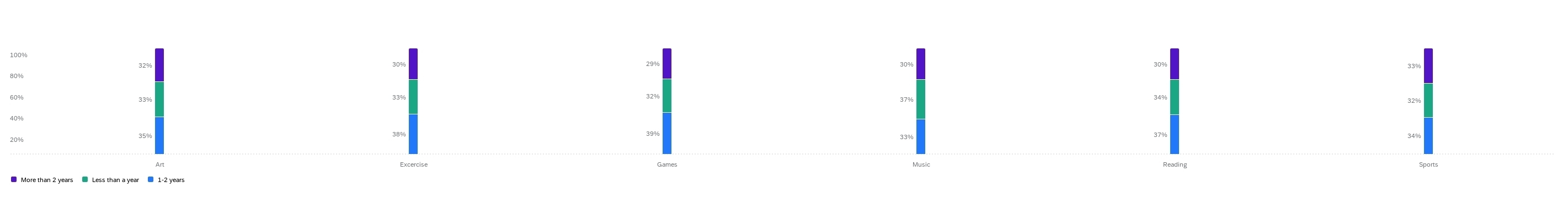
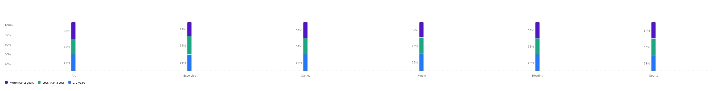
So I have a survey with a few loop and merge options. What I want to do is display all the loops for one question in one chart.
For example, say the question is “what hobbies do you enjoy” and I list out six choices. Then one of the loops is “how much time do you spend on these” and it’s a multiple-choice question with three options (how long you’ve been doing the hobby)
What I’d want to see is a series of stacked bars, with each hobby having a bar of it’s own with three segments representing the three choices. But, I don’t see any way to do that. I can put the first question on one axis and then a single loop on the other, and it displays what I want the results to look like, but if I change that to another loop choice, it changes all of it.
See the images below for an example. HOW they’re displayed is what I want. But both versions have slightly different values for all the six options because I used a different option on the data series in the editor.
So, my concern is how do I know which one of these is accurate, if any? How is it even pulling data for all six of the hobbies when I only pick one as the data series?
I feel like there has to be an easier way to do this. Loop and merge is a pretty common question type and there has to be a good way to display it without building one widget for every question/loop combination.