Device Identifier - Does "Mobile" include tablets? | XM Community
Question

Device Identifier - Does "Mobile" include tablets?

  • 3 December 2023
  • 7 replies
  • 221 views

Badge +1

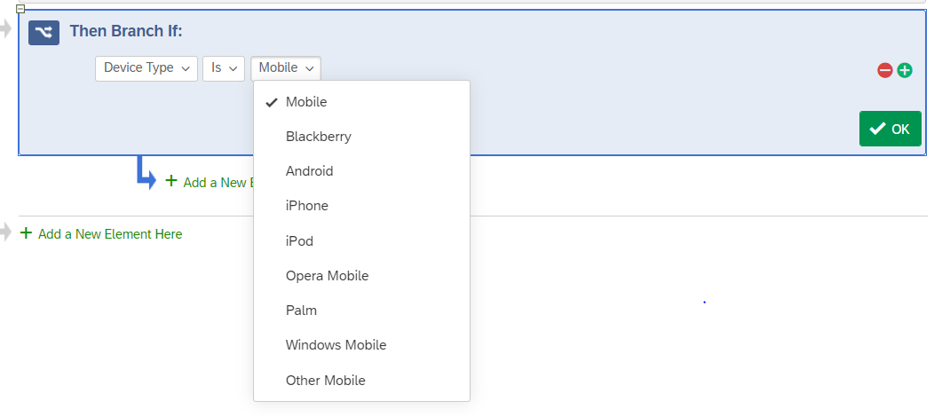
Hi! I’m trying to limit survey participants to those completing it on a computer, laptop or tablet. I don’t want the survey to be completed on a phone. If I use the Set Embedded Data /  DeviceIdentifier option, and then branch for those whose device type is “Mobile”, will this also exclude those completing it on a tablet? 

Thanks!


7 replies

Userlevel 6
Badge +39

If I recall correctly, DeviceIdentifier is an embedded data used to identify devices with the offline app, not something to differentiate mobile devices vs other platforms.

You can however use branch logic like this :

It is not clear however when tablets are included or excluded. For example, tests I’ve done in the past have included as mobile an iPad where I opened the survey link in the facebook app, but not when I opened the link in safari.

But usually, a tablet is considered to be a mobile device.

Badge +1

Thank you!

Is there another way to weed out those who are doing it on a phone but retain those doing it on a computer, laptop or tablet?

Userlevel 7
Badge +27

@LAtkinson,

Among mobile devices, you can use screen width as an additional screen for phones.

Badge +1

Thanks! 

Would this be one of the items captured automatically in the metadata question? I can branch and limit from there, but what is the typical screen resolution for a phone?

Userlevel 7
Badge +27

Thanks! 

Would this be one of the items captured automatically in the metadata question? I can branch and limit from there, but what is the typical screen resolution for a phone?

Screen resolution is captured, but not readily usable. Use JS window.screen.width and save it to an embedded data field. Depending on how strict you want to be, you can make sure the width is greater than 480 or 600.

Badge +3

@TomG How do I do the following:

Among mobile devices, you can use screen width as an additional screen for phones.

In my case it would be much better to have the mobile matrix table layout for tablets, but indeed the non-mobile questions are shown for tablets.

I would like to define that if the width is smaller than 1280, the mobile version shall be displayed, but I dont know how to implement it.

Can you help me?

Thanks!

Userlevel 7
Badge +27

@TomG How do I do the following:

Among mobile devices, you can use screen width as an additional screen for phones.

In my case it would be much better to have the mobile matrix table layout for tablets, but indeed the non-mobile questions are shown for tablets.

I would like to define that if the width is smaller than 1280, the mobile version shall be displayed, but I dont know how to implement it.

Can you help me?

Thanks!

This gets complicated. Qualtrics determines when to switch from desktop to mobile and vice versa based on window size and there is no way to control it. I have a function that always forces mobile (aka accordion), forceAccordion, that you can contact me about via private message. It would be possible to modify it to only work below a certain window size (e.g., 1280).


Leave a Reply