

Solved
In-question data visualization for constant sum?

 +2
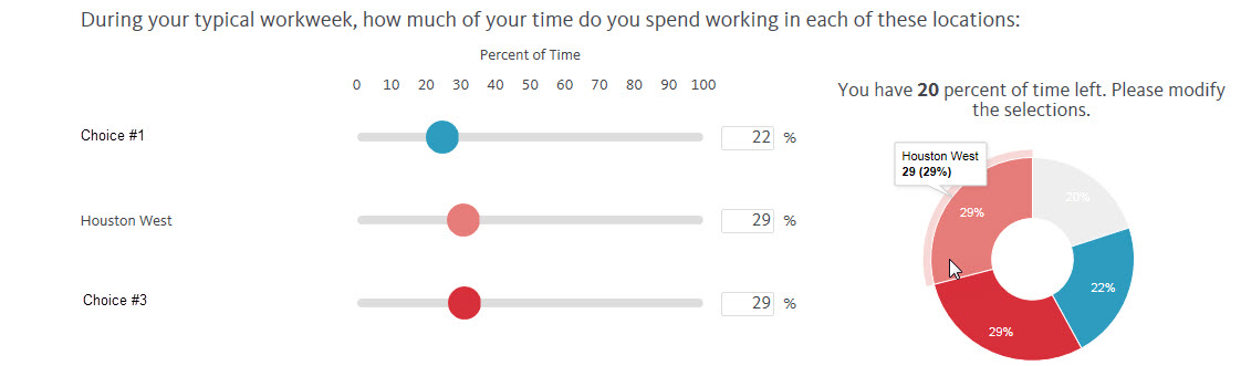
+2I've recently completed a survey on the Qualtrics platform in which a constant sum question was used with slider bars. What made this question unique, however, was that the question also included a doughnut chart which dynamically displayed the values attributed to each choice within the question and listed a message that "You have X% remaining." Can anyone offer insight into how this might have been accomplished? Image attached for reference.
!
Best answer by TomG
It is done with JavaScript. I've done it with a pie chart instead of a doughnut. There are a number of JavaScript libraries that do charts that can be used.
View original

Leave a Reply
Enter your E-mail address. We'll send you an e-mail with instructions to reset your password.