Hello,
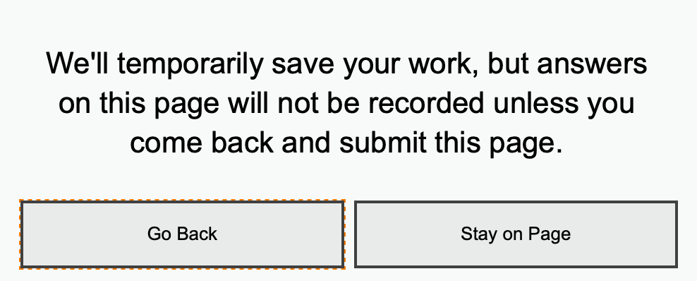
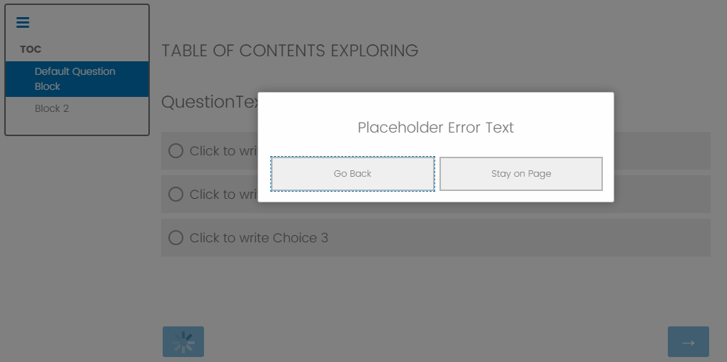
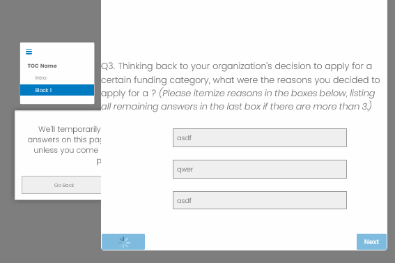
Can anyone tell me if they know of a way, through the system or maybe with JS of preventing the message pictured below from appearing. It pops up when you use the previous button in a survey that has the Table of Contents element. I never had this message pop up before in this survey, then I added a ToC and now it appears every time you move back.
Alternately, if it cannot be removed, is there a way to change the text?
Thanks!
How to remove the warning that appears when you use the previous button after adding the ToC element
Sign up
Already have an account? Login

Welcome! To join the Qualtrics Experience Community, log in with your existing Qualtrics credentials below.
Confirm your username, share a bit about yourself, then you're ready to explore and connect .
Free trial account? No problem. Log in with your trial credentials to join.
No free trial account? No problem! Register here
Already a member? Hi and welcome back! We're glad you're here 🙂
You will see the Qualtrics login page briefly before being taken to the Experience Community.
Login with Qualtrics

Welcome! To join the Qualtrics Experience Community, log in with your existing Qualtrics credentials below.
Confirm your username, share a bit about yourself, then you're ready to explore and connect .
Free trial account? No problem. Log in with your trial credentials to join. No free trial account? No problem! Register here
Already a member? Hi and welcome back! We're glad you're here 🙂
You will see the Qualtrics login page briefly before being taken to the Experience Community.
Login to the Community

Welcome! To join the Qualtrics Experience Community, log in with your existing Qualtrics credentials below.
Confirm your username, share a bit about yourself, then you're ready to explore and connect .
Free trial account? No problem. Log in with your trial credentials to join.
No free trial account? No problem! Register here
Already a member? Hi and welcome back! We're glad you're here 🙂
You will see the Qualtrics login page briefly before being taken to the Experience Community.
Login with Qualtrics

Welcome! To join the Qualtrics Experience Community, log in with your existing Qualtrics credentials below.
Confirm your username, share a bit about yourself, then you're ready to explore and connect .
Free trial account? No problem. Log in with your trial credentials to join. No free trial account? No problem! Register here
Already a member? Hi and welcome back! We're glad you're here 🙂
You will see the Qualtrics login page briefly before being taken to the Experience Community.
Enter your E-mail address. We'll send you an e-mail with instructions to reset your password.


 I couldn't get either the prevention or relabeling to work. I thought it might be our brand's dynamic theme, so I removed that and all logos, headers, made sure there was no other CSS or styles. It does move the error message box behind the questions, although when resize the screen it pops out. But the problem is the previous button still spins, doesn't move backwards, and message box persists, and now even when the message box is visible, it's "Go Back" button is deactivated. Was worth a shot; I'd really like to be able to suppress this message, have to use ToCs a lot...
