Matrix carousel not displayed correctly after adding display logic | XM Community
Skip to main content
Solved

Matrix carousel not displayed correctly after adding display logic


Forum|alt.badge.img+1

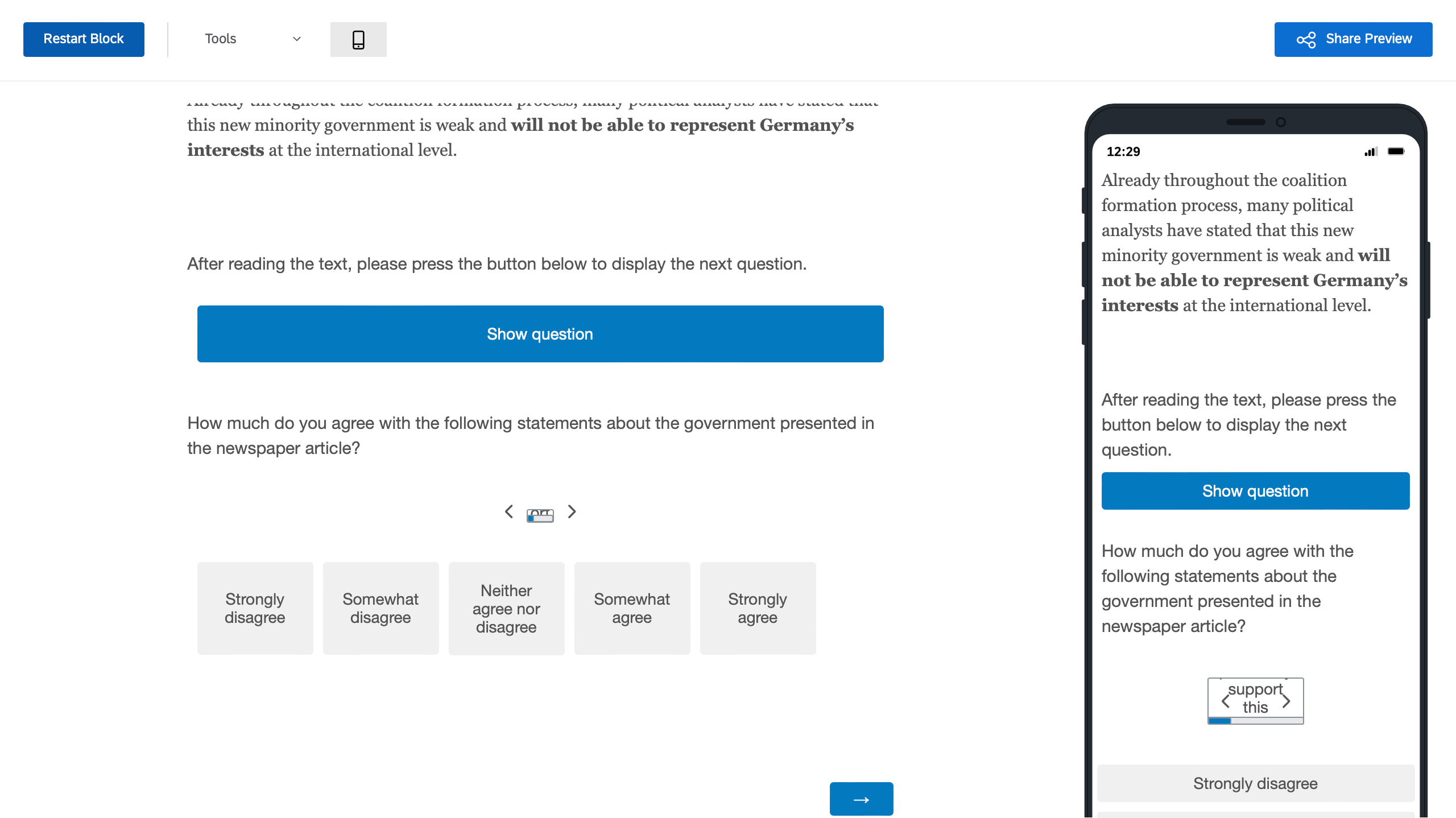
I set up a matrix carousel question after a rather lengthy bit of text. Because I would like to encourage respondents to first read the text, before reading the questions (on the same page), I would like to set up a “button” which triggers displaying the matrix carousel. I found a solution which works for me (involving a display logic dependent on a multiple choice question with only one option), however, this messes up the formatting of the matrix carousel (see preview screenshot). If I remove the display logic matrix carousel is displayed as expected. Is there a way I can circumvent this error or fix the formatting of the matrix carousel?  

Thanks in advance for helping! 


Best answer by praveengeorgeix

Try the below code replacing the initial one.


.CarouselCardFrame { position: relative; width: 500px !important; margin: 20px 0; height: 244px !important; border: 1px solid #89919a; border-radius: 2px; }

@media only screen and (max-width: 600px) {
.CarouselCardFrame { position: relative; width: 100px !important; margin: 20px 0; height: 50px !important; border: 1px solid #89919a; border-radius: 2px; }
}


View original

7 replies

praveengeorgeix
QPN Level 4 ●●●●
Forum|alt.badge.img+11

Would you link to share the link to inspect element.


Forum|alt.badge.img+1
  • Author
  • 3 replies
  • March 8, 2024

praveengeorgeix
QPN Level 4 ●●●●
Forum|alt.badge.img+11

@Luksh from what I can see is for some reason the width and height is getting disabled. 

I have added an important marker to keep it enabled.


.CarouselCardFrame {
    position: relative;
    width: 500px !important;
    margin: 20px 0;
    height: 244px !important;
    border: 1px solid #89919a;
    border-radius: 2px;
}


Please try adding this in the below Custom CSS


Forum|alt.badge.img+1
  • Author
  • 3 replies
  • March 8, 2024

Thanks @praveengeorgeix! This worked for desktop, but now on mobile view the statement exceeds the border to the right. I tried modifying the Custom CSS also by looking into the replies from related forum posts, but can’t seem to figure it out. 


praveengeorgeix
QPN Level 4 ●●●●
Forum|alt.badge.img+11
  • QPN Level 4 ●●●●
  • 99 replies
  • Answer
  • March 8, 2024

Try the below code replacing the initial one.


.CarouselCardFrame { position: relative; width: 500px !important; margin: 20px 0; height: 244px !important; border: 1px solid #89919a; border-radius: 2px; }

@media only screen and (max-width: 600px) {
.CarouselCardFrame { position: relative; width: 100px !important; margin: 20px 0; height: 50px !important; border: 1px solid #89919a; border-radius: 2px; }
}


Forum|alt.badge.img+1
  • Author
  • 3 replies
  • March 8, 2024

This worked! Now all I need to do is fiddle with the parameters until I like it. Thanks so much for your help today, @praveengeorgeix!


praveengeorgeix
QPN Level 4 ●●●●
Forum|alt.badge.img+11

No worries @Luksh

Take care

Praveen


Leave a Reply