How to display change in score - Month vs Month | XM Community
Skip to main content

Good morning all,

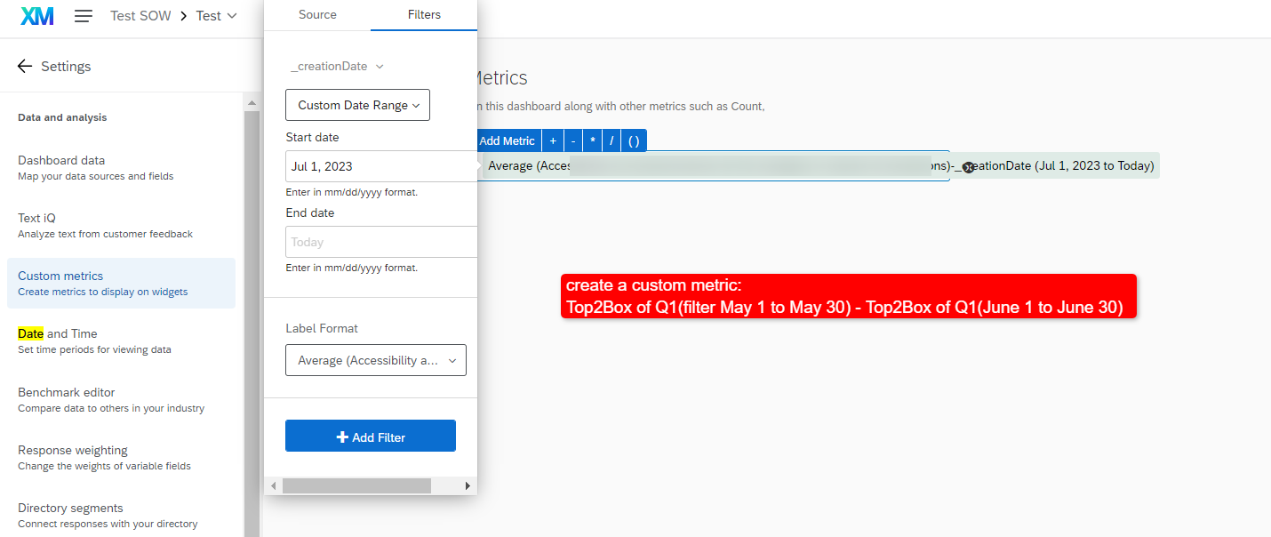
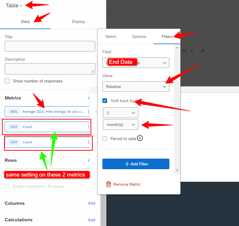
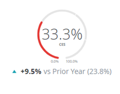
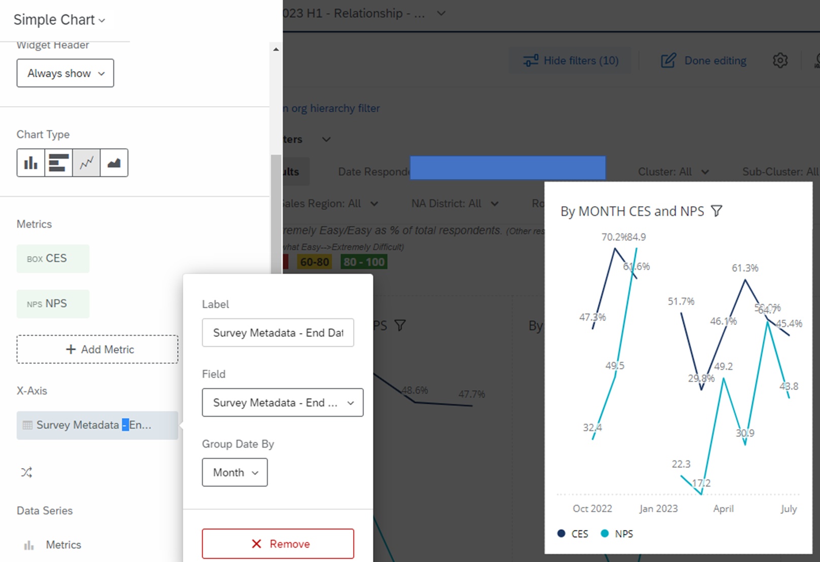
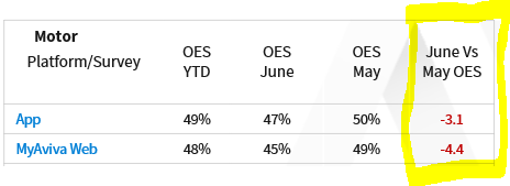
I’m yet to discover a way to display a month vs month score change and I am hoping someone can help. We can certainly provide the information for stakeholders to work out the difference between, say a score of 47% one month, 50% the next, but we are being challenged to provide this comparison clearly due to having a vast program in place.


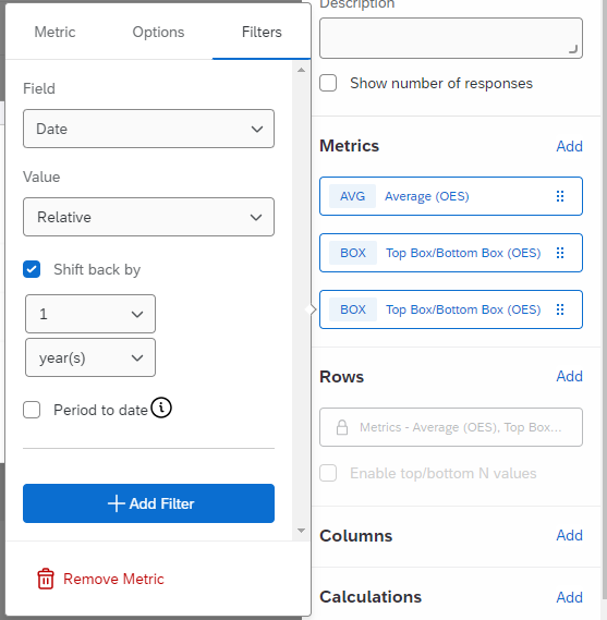
We’ve been able to make great use of the many fantastic widgets in the CX Dashboards but this is a gap that is blocking us from automating more of our weekly/monthly reporting. Please see attached for an example of what I’m looking to recreate.


The Comparisons & Benchmarks features we do use, but are keen to not have to manually update these numbers each month. 

Hi @Monko ,


The image you shared is blur and it’s giving some error on opening. Can you please re-share?


Based on the query you sent, if you are looking to have yearly,current-1,current month score, you can use a TableChart with 3 average metrics of CES score.

The first metric can have a filter of “End Date” as yearly

The 2nd and 3rd metric can have a separate filters as below:


Please share more details in case you are looking for something else and I have misunderstood.


If you just want to show current month vs prior month, you can use a gauge chart and include a comparison (bottom setting in the Data settings of this widget) - you can create a custom metric with prior month filter, as an example. Below example is vs prior year.


If you want to show a trend line month by month, you can use a simple chart with the date on the X-axis (example below):


Hi @Sowrabh1993,

Thank you kindly for the swift reply - this looks like we may be on the right track. However, I’m seeing the same score number for metric #2 and metric #3. In metric #1, the Average box, I’ve left in default settings but filtered Date to yearly. For reference, we have named it Date in the Dashboard Mapping but this is using the End Date as you’ve done.

Have I missed a step in your example above?


The screenshot I tried to share is as below, with the final column (with the awful yellow highlighting!) being the type of data we are trying to show. For reference, this screenshot is from Microsoft Excel.


Hi,


I think you will need to use Top Box instead of average metric.

For the 2nd and 3rd column, you can apply the filter on the 2nd and 3rd metric in the same way but for the filtered date should be June and May respectively.

For the last column, you will need to create a custom metric in the Mapping page as below:

I hope this helps


You can use veritical chart, can add score in x-axis and record date field in data-series. Then group the data series field by month.


Thanks all of you for the assistance!

The Custom Metrics was the one that has worked for our stakeholders most. Not perfect (some of our scores are made of some mega weightings and large numbers of surveys!) but decent and more than we had before :)


Leave a Reply