Introducing the New Look & Feel | XM Community
Skip to main content
As some of you may have already noticed, the Look & Feel editor has received a major upgrade!


!
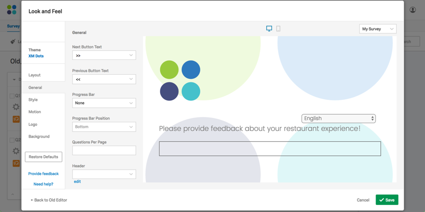


Some of the awesome new features include, but are not limited to:

• AUTOADVANCE - now people can fly through your survey without clicking a single Next button ;)

• New dynamic themes!

• Logos! Make 'em banners, make 'em float, make 'em entirely separate from the header!

• Different Layouts!


Although Look & Feel will eventually change for everyone, only a few of you have this new editor right now. If you're interested in checking it out, contact your Account Executive or your Customer Success Representative!


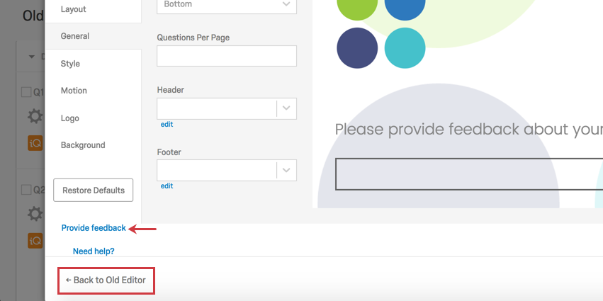
PS - Like the old editor? Click Return to Old Editor. (Although why would you need to? The new one has so much new, cool stuff, PLUS all your old themes!) And please, give our fabulous engineers some feedback by clicking that Provide feedback link. (You might need to scroll down a little to find it.)


!
Thanks for the update! After playing around with the new options I have a few questions.


1. Do you know when the Old Editor will go away


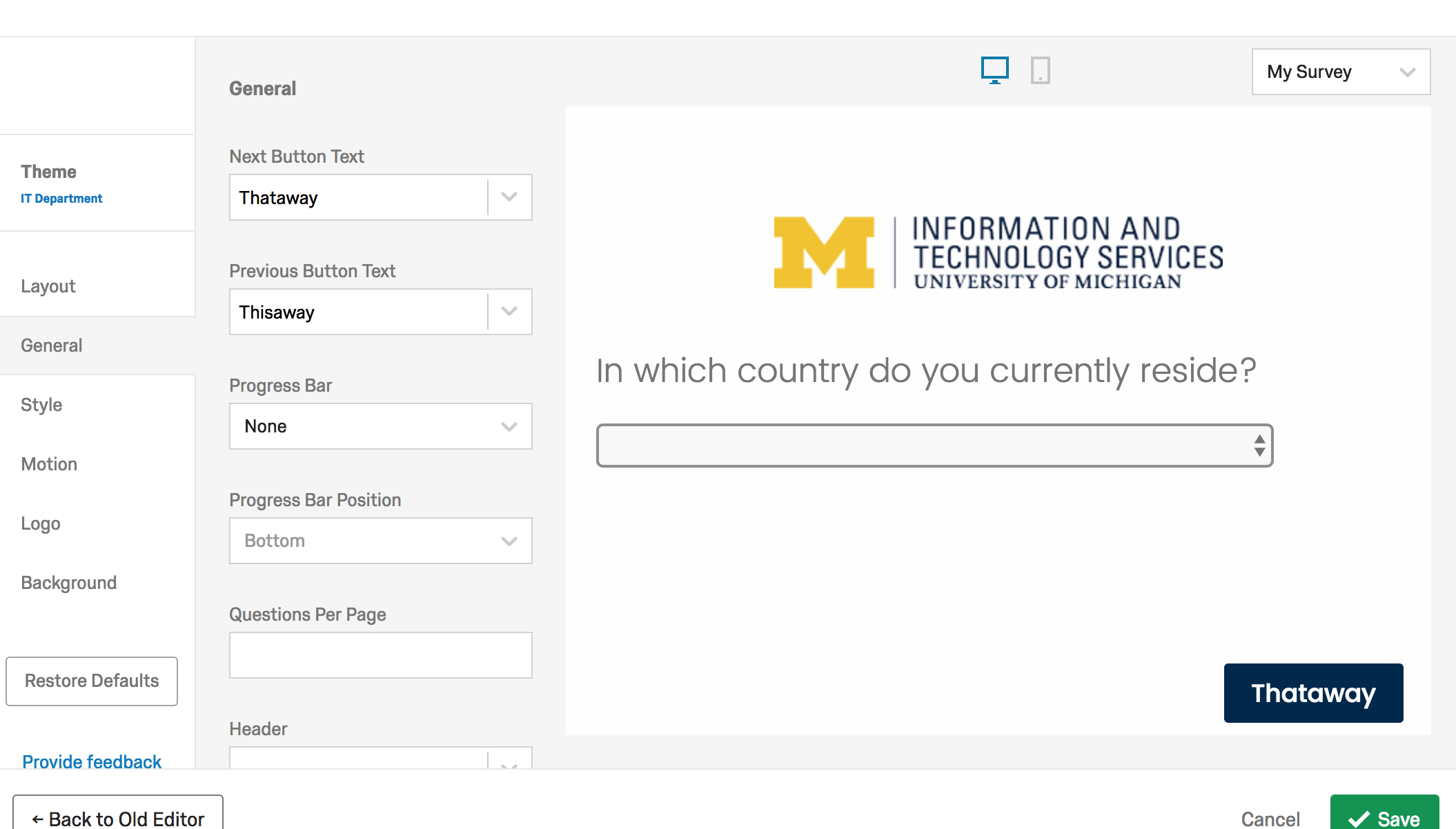
2. Are there plans to allow edits to be made to existing themes we have created. For example, the University of MN has paid to have various themes created. We like to be able to edit minor things in these themes such as changing the text for the NEXT and BACK buttons. This functionality has been removed. Will it be added back in before Old Editor goes away?
I agree with @uhrxx005, unless the ability to modify existing themes is added the new interface is a huge step backward.
I am able to make these little changes on a per-survey basis in the new L&F. Are you referring to making permanent changes to the themes?


!
@Britain, that is different than what is happening on my end. Our custom themes are showing up as "Static Themes" now and all of the tabs on the left (Layout, General, etc) are grayed out
> @uhrxx005 said:

> Thanks for the update! After playing around with the new options I have a few questions.

>

> 1. Do you know when the Old Editor will go away

>

> 2. Are there plans to allow edits to be made to existing themes we have created. For example, the University of MN has paid to have various themes created. We like to be able to edit minor things in these themes such as changing the text for the NEXT and BACK buttons. This functionality has been removed. Will it be added back in before Old Editor goes away?


> @TomG said:

> I agree with @uhrxx005, unless the ability to modify existing themes is added the new interface is a huge step backward.


While it'll take a couple of quarters for the new editor to roll out, I don't know when he have plans to completely phase out the old editor.


I've talked to our Look & Feel team, and they've said older, "static themes" will be available for edits by the end of next week. 🙂 Apologies for the lack of clarity there!
Actually, ours have changed since I first looked at it this morning. Our themes now show up twice as Themes where they can be modified and as Static Themes where they can't. However, the Themes that can be modified are VERY different from the original (static) themes. So, it would take a fair amount of tinkering just to get them to look like the original themes as a starting point.
@TomG That's really great feedback. I'd suggest you use the Provide Feedback link in the product, or contact our support team to submit a Feature Request.


If anyone has any other additional feedback, please provide feedback through the editor or submit it to our support team. If you're currently having trouble with the new editor, you can switch back using the Old Editor link at the bottom-left.


The reason that we roll out features in this manner is so we can get feedback from you like this. We appreciate you sharing your thoughts!
> @uhrxx005 said:

> @Britain, that is different than what is happening on my end. Our custom themes are showing up as "Static Themes" now and all of the tabs on the left (Layout, General, etc) are grayed out


The same thing is happening for me!
I am hearing from my local users that they are having trouble tweaking background and foreground colors in our theme. (We'll report through the channels @KatharineS mentioned above, I'm mentioning it here to show solidarity with @uhrxx005, @TomG, and @manresaclara!)
I don't see any menu item for themes. If it matters, we have not constructed our own themes, but have always used one of the built-in themes
@BruceK If a tab is missing in the product, I would recommend contacting support! It may be related to your account's permissions.
@TomG I am seeing the same thing on my end. Our new dynamic versions of the themes do not look anything like the originals. However, we are now able to edit the General, Style, and Motion tabs when using our static themes, so there isn't much of a need for us to use the dynamic ones.
@uhrxx005,


I'm seeing the same thing. Our Client Success Manager contacted me last week and told me they would have it fixed by the end of last week, and they have lived up to their word. It is encouraging they they heard the feedback and acted on it without delay.
@KatharineS


Hi,


We couldn't find the old theme that uses the REAL radio button for multiple choice questions, which is a really big issue for us since we are conducting a psychology experiment on the factors that influence people's decision.


It would be great if we get to use the classic radio button without all the fancy updates, we get that it's all minimalism and flat and 2019 but it would be really appreciated if we aren't forced into changes that dramatically affect our experiment.


Also, it might be a good idea to allow users to design themes on their own. A lot of organisations don't place the brand image as their priority and it's up to the frontline people to get it done. The new update isn't helping.


Thanks
Hi @qualtrics_user!


If you have not yet already, I’d recommend posting your idea about adding a layout with radio buttons in the new look and feel in our Product Ideas category, as it is a feature not already developed by our team. Be sure to review the How to Write a Good Product Idea template and our Ideation Guidelines before you post your idea! In the meantime, you can always go back to the old Look and Feel by selecting Return to Old Editor, and choose a theme with radio buttons!


The process for a Brand Administrator requesting a customized theme for their organization is the same as before! While our Design Team works on the custom theme, users are able to add their organization logo directly into their survey with the new Look & Feel. They can do this by selecting a Dynamic - blank theme and then heading to the Logo section.


As always, if you have any additional questions, feel free to reach out to our wonderful Support Team!
Hi @KatharineS,

I started to use the new version a couple of weeks ago. I like that even users who don't want to learn CSS have much more possibilities to modify the appearance of their surveys. However, I'm missing the options to turn on the question separator and change its colour, which were available in the old editor.
@fleb I believe the question separator has been replaced by Question Spacing settings in the Style section. However, if you like the question separator and believe it should be brought into the new editor, I recommend posting this in our Product Ideas category, as it is a feature not already developed by our team. Be sure to review the How to Write a Good Product Idea template and our Ideation Guidelines before you post your idea!

Leave a Reply