Weekly Product Release Notes - September 14, 2022 | XM Community
Skip to main content

Weekly Product Release NotesRecent Updates bannerReleased On Or Before September 14, 2022


CoreXM


  • Collaborative Preview Links: Survey creators can now control who can access survey preview links. Links can be limited to only users within the brand, or made public so anyone with the link can access. This feature will be gradually rolled out to customers starting September 7, 2022 and concluding September 28, 2022.

  • CX Dashboards


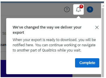
  • Dashboard Export Notification: Now when you export a page of the dashboard, you’ll get a notification when the file is done being prepared and is ready for download.

  • Employee XM


  • EX Engagement Benchmark Refresh: The EX Engagement Benchmark has been refreshed to include 2019-2021 data. The data will be available within the benchmark editor settings menu in EX dashboards.

  • Upcoming features BannerStarting On & After September 21, 2022


    Employee XM


  • Extract Recruiting Data from SuccessFactors Task: Automates a candidate data export from SuccessFactors.

  • XM Directory


  • Contact Deduplication with Embedded Data: Users can now select embedded data fields when merging newly created contacts in XM Directory, in addition to the fields “External data reference”, “Email”, “Phone number”, “First name”, and “Last name”.

  • XM Platform


  • Field Selection for Results Dashboards Report Pages: Users can now select the survey fields they would like to include in each page when creating a new report page within Results Dashboards.

  • Feedback & Questions Banner*Disclaimer: Release dates are approximate and are subject to change. Not every feature is guaranteed to be included in Upcoming Features.


  • If you have any questions about the product updates featured in this list, our support team is happy to help you with your request. 

  • If you have questions about what’s on the product roadmap, please see our Product Roadmap page. If you’d like to contribute to the product roadmap, please visit the Product Ideas category.

  • You can provide feedback on the Weekly Product Release Notes here.

Re the Dashboard Export Notification, we're already seeing churn from this change. I really can't understand the logic here. The export worked perfectly fine and all this change does is add clicks to get to the file you actually went to export in the first place. Why not just let it continue to download once you confirm the first interstital pop up instead of forcing me to a 2nd pop up (which I'll hope is temporary) to have to click to open the notifications menu to click to download the file. I don't get Qualtrics this desire to add clicks across the platform it's coming in EVERYWHERE and is counteractive to good design philosophy. This makes it HARDER for me to get my file, not easier.


https://community.qualtrics.com/XMcommunity/discussion/comment/49727#Comment_49727Hi James, thank you so much for the valuable feedback here. I think you bring up some interesting points! I'd love to connect you with someone internally here at Qualtrics to discuss this further; I'm going to email you at the email address we have on file to go about arranging that. Thank you!


Hi Michael_Cooksey ,
Thanks for replying on this. Can you confirm who should be seeing this new method of exporting as my method is still the old one which is you click on the export button on said widget and then in Chrome is displays the downloaded file at the bottom. Perhaps I need to click on 'Redesigned dashboards are coming soon for all users. You can make the switch now, or keep using the existing experience until then. Try it now.' ?
Regarding the download change as a whole... Has this change gone through the normal preview process? I'm uncertain that it ever did and has been rolled out for accessibility reasons? It would be good to pass this through a preview process as I think a few months ago there were many people highlighting the problems that the new download method caused. From my perspective, in the last version I had to scroll up to the top of the page to get to the icon in order to see the downloads, thus loosing my place within the dashboard (which can be rather long sometimes). This caused alot of issues as I was trying to do analysis and therefore lost my place just to get the download.

Just my thoughts - I hope this new release is not the same as what was rolled out a few months ago.

Thanks

Rod Pestell


https://community.qualtrics.com/XMcommunity/discussion/comment/49741#Comment_49741Hi Rod, thanks for the questions. Let me ask internally and see if I can get some more info for you. Stay tuned!


Hi Michael_Cooksey
If someone would like to reach out to me that's absolutely ok, I've already met with teams around dashboard 2.0 to discuss changes there and see changes in other backend systems hence the feeling that more clicks are coming into lots of different places. There's also different download mechanisms across the site that can have their own "your downloads" sections (data and reporting, content engagement, distribution) . I wonder will this change in future updates as well?
I've shared this feedback with our TAMs by way of confirmation there was no issue.. they advised they would pass it on to product as well and offered this by way of the problem statement being solved for:

The main reason why this feature was developed is for long running exports (exports that require processing of a lot of data). It allows users to navigate to different parts of the platform without losing their export.Let’s say you have an export that takes 10 minutes to generate because there is a lot of data. Previously, you had to keep Qualtrics open until the export was ready. Right now, you can close Qualtrics and come back later and your export will still be there.

I get the logic in that but even though our program is massive in terms of the volume of data we carry I've never once encountered this issue where I've lost a download as a result of it taking to long and me doing something else. I guess since I always have multiple Qualtrics tabs running it never became an issue
To Rod_Pestell's point I don't recall seeing this one as a preview. I don't know if it is a big enough change to warrant a preview but it's often these small changes that seem inconsequential that generate more pain than expected.
By way of a means to address it, maybe a popup could appear in this spot where that blue button would allow you to trigger the download?

image.png


Hi there, JMoran_eBay and Rod_Pestell --
Thanks for your patience while asked around for some more info.
It's my understanding that this new feature did go to the preview group (last year) before deployment. Additionally, it's my understanding that there was a bug in a previous iteration on dashboards 1.0 you have to scroll all the way up to click a button that notifications would show up in the bell; that has been fixed.
This next bit may be similar to what you have already been told, but the engineer I spoke with told me that the reason to make exports asynchronous is to help with large dashboards where exports take multiple seconds to minutes, the desire to avoid having customers to wait on the dashboard for exports. With the new async model, users are free to navigate to other pages of Qualtrics -- even out of the browser -- and the export will still be there in the notifications area.
Additionally, I was told users do not need to scroll all the way up after each export. You can perform all the exports you need and at the *end* scroll up to get all their downloads.
I am going to see if I can find some UX designers to hop into the conversation and receive your feedback; please bear with me as I work through that process. I definitely hear your feedback and acknowledge the pain points you bring up. More soon!


Thanks Michael, I'd love to get some time with the UX folks on this because while I get the logic for large downloads, I'd love to see some data on how often this is an issue and the impact it has on performance for the dashboard. I often pull down large files without an issue like this.
I want to download a JPG and I'm forced to wait for this process and then navigate up. I refute the response that I can do all my downloads and then scroll up.. I might not know what downloads I need at a given point and only after viewing a file decide I need a different cut of data and so on.. avoiding scrolling till the end is not really possible unless you know you need multiple downloads.
Why can't the system use a dynamic function that allows small downloads to come down as has been the case and pushes bigger downloads to your async process and all downloads can be available via the panel at a later point if reqd.
Overall I've struggled a lot with UX changes recently as they're just making more work for me and don't address obvious issues .. like this one for example just looking at the export fxn at a widget level for a simple table: why when I export a JPG of a table does it not give me a file covering the entire widget? It gives me partial data which is frankly useless. If I am extracting the widget I want it all not a portion of it.


to add to this conversation....
-I'd like to point out that the download list uses the same name for each download. So if you have multiple downloads there is no easy way to work out which is which. I'd like to ask that the download name reflects the widget title.
-I am currently still having to scroll up to the top of the page to see the notification bell but that might be because we are in some sort of middle ground between dashboard 1.0 and 2.0.
-I'm trying to understand what is meant by 'large downloads'. I download many data pieces for each widget from a large dashboard and the download is very small. Are you suggesting that people are downloading the whole dashboard in csv format? That would involve a large volume of data as it's just the raw data I imagine but I'm not sure why they would be doing that in the first place. To plug into powerBi or something? I would challenge the use there!
-On that note - I raised a request for the ability to download all data points from all widgets from a whole dashboard (ie not the raw data). It a bit like highlighting the webpage and copying and pasting into excel which you can currently do but it's fiddly now that 2.0 has come along as the titles and other pieces to identify each widget are overlays (svg elements). This should be in progress as this was the only way we would accept the move to dashboard 2.0.
-Furthermore (an apologies for digressing), the widget filter capability is a step backwards - you can no longer compare the filters from multiple widgets on the same page any longer. It's so much more difficult and will I am sure cause data errors in the future. Having the ability to view the filters in situ within each widget was perfect in my view.

Thanks
Rod Pestell


Hello JMoran_eBay and Rod_Pestell -- apologies it's taken me longer than normal to get back to you on this thread. It's my understanding after doing some research that, per the designers, the functionality is set as it behaves now, but I am still working on tracking someone down to hear your feedback.
Additionally, if you have not already, I'd also strongly recommend joining our UX panels. This is a great way to be a part of the process and give feedback directly to our research team.
I will do my best to close the loop on this thread very soon and let you know if I am able to set up a call.


Hi Michael, can you explain the difference between the Previews programme (I am a frequent attender of) and the UX Panels?
Thanks
Rod Pestell


Michael_Cooksey, JMoran_eBay and Rod_Pestell
I will reach out to our UX design and research teams to share this feedback and will share anything they come back with.
Rod_Pestell, the preview program is a different channel for customers to have early access to features for them to try out and share feedback in a group meeting.
The UX research panel is comprised of Qualtrics customers and users who are interested in being invited to UX research studies as participants. Usually the research is on future facing UI and UI that is under design and development. We would only contact you if you fit the criteria of the type of Qualtrics user we are targeting specifically. You can join the panel, but you are not obligated to take part in studies that you were asked to participate in. We also provide gift card gratuities for our participants.


https://community.qualtrics.com/XMcommunity/discussion/comment/50170#Comment_50170Thanks for picking this up. Our company is offered previews, we've participated in a few in the last few years (no gift cards though?!? ) and I don't recall this one. Might have slipped through on us though. Any chance to offer feedback is welcomed :)

James


JMoran_eBay I spoke to our UX research for dashboards and reports and she let me know that this is a common issue that the product team/engineers are going to fix. They're still trying to figure it out, but it's likely they they'll give people the option of having the download happen automatically or go to the Notification Center.
Definitely check out our UX research panel sign up page: https://www.qualtrics.com/ux-research/
Michael_Cooksey also created a new category in Community where the team will advertise opportunities to community members to participate in our UX research studies.😊


https://community.qualtrics.com/XMcommunity/discussion/comment/50141#Comment_50141I'd echo the comment on the last point about widget filters. Not being able to see the applied filters across multiple widgets at the same time is a real step backwards. As Rod says, it WILL lead to data errors. I get you want a consistent UI layout, but doing so at the expense of functionality is not a good road to go down.


The new updates to the preview link are extremely aggravating. Even after changing the Share Preview option to Public, you have to copy and paste the exact link from the pop-up. It is really annoying that we can't use the standard preview link (https://survey.qualtrics.com/jfe/preview/SV_example) to access the preview when the setting is set to public.


Has anyone figured out a way to make Preview Emails useable for "outside of the brand" recipients? Testing quick start emails across users in different sections of a parent company (i.e. some users have email addresses not considered as 'in brand') has become impossible so far.


https://community.qualtrics.com/XMcommunity/discussion/comment/50193#Comment_50193Thanks Sabina, I'm guessing this will come in a future weekly update then?


Hi JMoran_eBay, that is my assumption, however, I don't know how far in the future it will be :)


Leave a Reply