Piped text in report charts? | XM Community
Skip to main content
Solved

Piped text in report charts?


I have piped text into the title text above a chart to show the number of responses to the question. However, I have a series of stacked bars in one chart that each may have a different number of responses. Is there a way to pipe the number of responses into each of the axis labels? (For example, Roses n=X and Irises n=X.)

Best answer by Eesh

@DSGrim, Thanks for sharing screenshot. Have further explored and checked with the team, it seems we can't pipe in text to display dynamic scores in the charts. Since bar charts are visual representation of data so it is static in nature. Look forward to support you in another case.
View original

9 replies

Eesh
QPN Level 2 ●●
Forum|alt.badge.img+3
  • QPN Level 2 ●●
  • 67 replies
  • August 29, 2018
Hi DSGrim, The only possible way I can see is you have to manually add the no of responses into each of the axis labels. However, to help you in a better way would it be possible for you to share the screenshot of what you are envisioning.

LaurenK
Former XM Community Team Member
Forum|alt.badge.img+13
  • Former XM Community Team Member
  • 900 replies
  • August 29, 2018
Hey @Eesh! Be sure to tag users using @ so they get notified!

  • Author
  • 7 replies
  • August 29, 2018
@Eesh , Thanks for the response, but I was really hoping to pipe in the numbers so that the report would update if more survey responses occur. Another possibility would be if I could place little text boxes with the respondent count to one side of the chart, but I haven't found a way to place visualizations side by side, although the documentation appears to suggest that is possible.

Eesh
QPN Level 2 ●●
Forum|alt.badge.img+3
  • QPN Level 2 ●●
  • 67 replies
  • August 29, 2018
@DSGrim, Well, the second option seems possible. Would it be possible for your to share the screenshot, if possible? It would help me to explore how best we can tweak the widget as per your requirement.

  • Author
  • 7 replies
  • August 30, 2018
@Eesh , Here is a jpeg of one of the charts. ! 
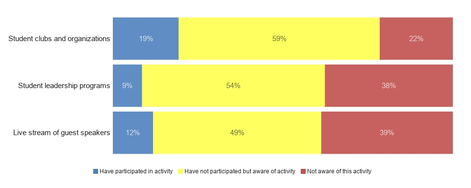
I was thinking a text box to the right of each bar could hold the text (n=x) with the x being piped in.

Eesh
QPN Level 2 ●●
Forum|alt.badge.img+3
  • QPN Level 2 ●●
  • 67 replies
  • Answer
  • August 30, 2018
@DSGrim, Thanks for sharing screenshot. Have further explored and checked with the team, it seems we can't pipe in text to display dynamic scores in the charts. Since bar charts are visual representation of data so it is static in nature. Look forward to support you in another case.

  • Author
  • 7 replies
  • August 30, 2018
@Eesh, So putting little text boxes to the right of the chart can't be done either?

Eesh
QPN Level 2 ●●
Forum|alt.badge.img+3
  • QPN Level 2 ●●
  • 67 replies
  • August 30, 2018
@DSGrim, No, I am afraid. It is not possible.

  • Author
  • 7 replies
  • August 30, 2018
@Eesh , OK, thanks for all the time and thought you put into it.

Leave a Reply